Maryanne Color Palette - June 2025
The first color palette of 2025 is (finally) here! Let me introduce you to Maryanne:

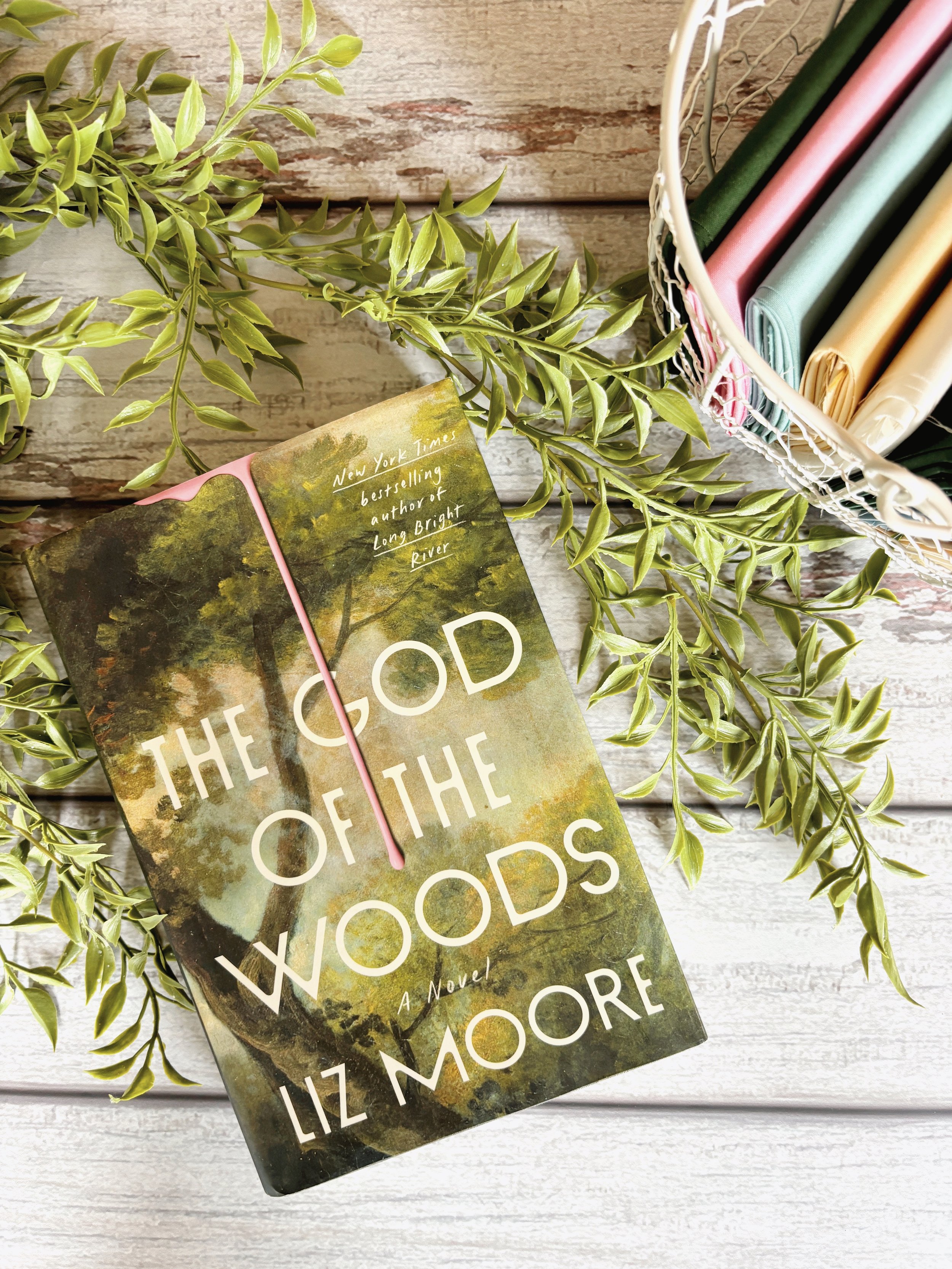
This book was the first of 2025 I gave a 5 of 5 star rating too. And with the bold pink paint on the cover, how could I NOT make this into a color palette? This moody, slow-burning thriller had me guessing from the first chapter, and it never let me go.
The main reason I loved this book was in how masterfully it kept me guessing. Every time I thought I had a handle on who had done it (what had happened), the story would shift, revealing new secrets, new perspectives, and new layers of tension. The mood was eerie in all the right ways, and the characters were real and relateable. While a few characters could get on my nerves, in the end, they left me haunted.
I also enjoyed how the book made me indirectly think about the "trials" of the rich. Many times I was angry, however, there were a few moments where I felt sympathy for characters.
One of my favorite elements of the story was how story points that felt they weren't needed, came back around. My favorite was around “Scary Mary.” Without giving anything away, the way this arc unfolded was both surprising and deeply satisfying. What seemed like a simple urban legend turned into something far more nuanced and chilling. My favorite scene and what really got me thinking that things weren't all that they seemed was the bed room paint scene.
If you’re into suspenseful reads that are as emotionally rich as they are mysterious, God of the Woods is one I highly recommend. It’s the kind of book that lingers — and I’m still thinking about it months after finishing. And, with it being located at a summer camp, it is the perfect summer read!
I immediately knew I wanted to use the pink. On the cover it provides an eerie similarity to a blood drip and gives the illusion to a cover up. The moody sky translates into a faded blue and a light brown that feels like a faded 1970's memory. To add a punch and the feeling of getting lost in the woods, I pulled in the dark green of the trees.
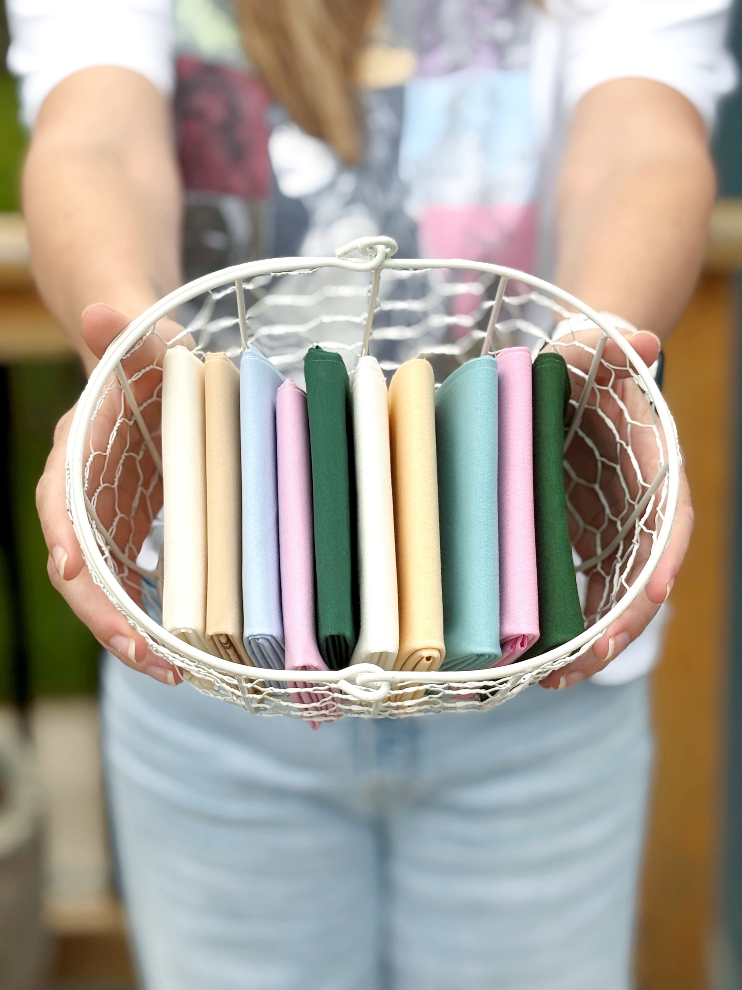
The PBS Painter’s Palette Solids used are:
121-099 Rice Paper
121-198 Robin Egg
121-181 Shortbread
121-120 Petunia
121-074 Forest
The AGF Pure Solids used are:
PE408 White Linen
PE569 Forget-Me-Not
PE486 Vanilla Custard
PE599 Cosmos
PE466 Hunter Fields
I hope you enjoy this color palette and are inspired to make something from it. As a reminder, my newsletter subscribers get the scope on my color palettes first and with a few extras! Head over to my sign-up page to get in on the good stuff!
Don’t forget to take your makes using this palette by tagging me (@oh_hellojenny) and using the hashtags #ohjquilts and #ohjcolor palettes. If you read it - let me know what you think!